Pickleball Gym App

Designing a Pickleball Gym App That Reduces Friction Between Players, Courts, and Time.
I redesigned a fragmented scheduling experience into a clear, social, and scalable system for a fast-growing local pickleball gym.
Overview
This project explores the redesign of a mobile app for a local pickleball gym, focused on scheduling open play, managing waitlists, sharing announcements, and enabling member-to-member chat. I was tasked with improving clarity, reducing booking friction, and creating a foundation that could scale as the gym community grew. The goal was to move from a functional but disjointed v1 experience to a more intuitive, member-centered v2.
Your Role & Team
I led end-to-end product design, from user flows and wireframes to high-fidelity UI and prototyping. I worked independently but designed with realistic handoff constraints, drawing on my background in marketing to balance member needs, business goals, and operational realities.
The Problem
Members struggled to understand what was happening at the gym and how to participate. Booking flows were rigid, announcements were easy to miss, and chat lacked context. From the business side, staff needed a way to reduce manual coordination, increase session fill rates, and keep members engaged outside of booked play. Success meant fewer missed sessions, faster decision-making, and higher participation across skill levels.
Goals & Success Metrics
The goal was to reduce user uncertainty and decision friction across scheduling, waitlists, announcements, and chat. The product needed to help members quickly understand their options, take action with confidence, and coordinate play without cognitive overhead.
Product UX metrics
Higher completion rates for core flows (open play signup, court booking)
Reduced abandonment at key decision points (date selection, waitlist entry)
Faster time-to-action from app open to first meaningful interaction
Improved task success and error recovery in chat and coordination flows
User experience signals
Users reported greater clarity around availability and system status
Fewer questions about waitlist behavior and next steps
Increased confidence navigating the app without guidance
Perception of the app as predictable, calm, and easy to use
Research & Discovery
I reviewed existing scheduling apps, fitness class platforms, and community-based products. Early flow mapping revealed that most friction came from uncertainty. Users didn’t know what was available, what applied to them, or what would happen next. This insight shifted the focus from adding features to improving visibility, hierarchy, and feedback.
Defining the Opportunity
The opportunity was to turn the app into a “gym command center”—a single place where members could see what’s happening now, what they’re booked for, and how to join in. I anchored on three principles: show status clearly, reduce decision steps, and make social participation feel lightweight rather than intimidating.
Exploration & Ideation
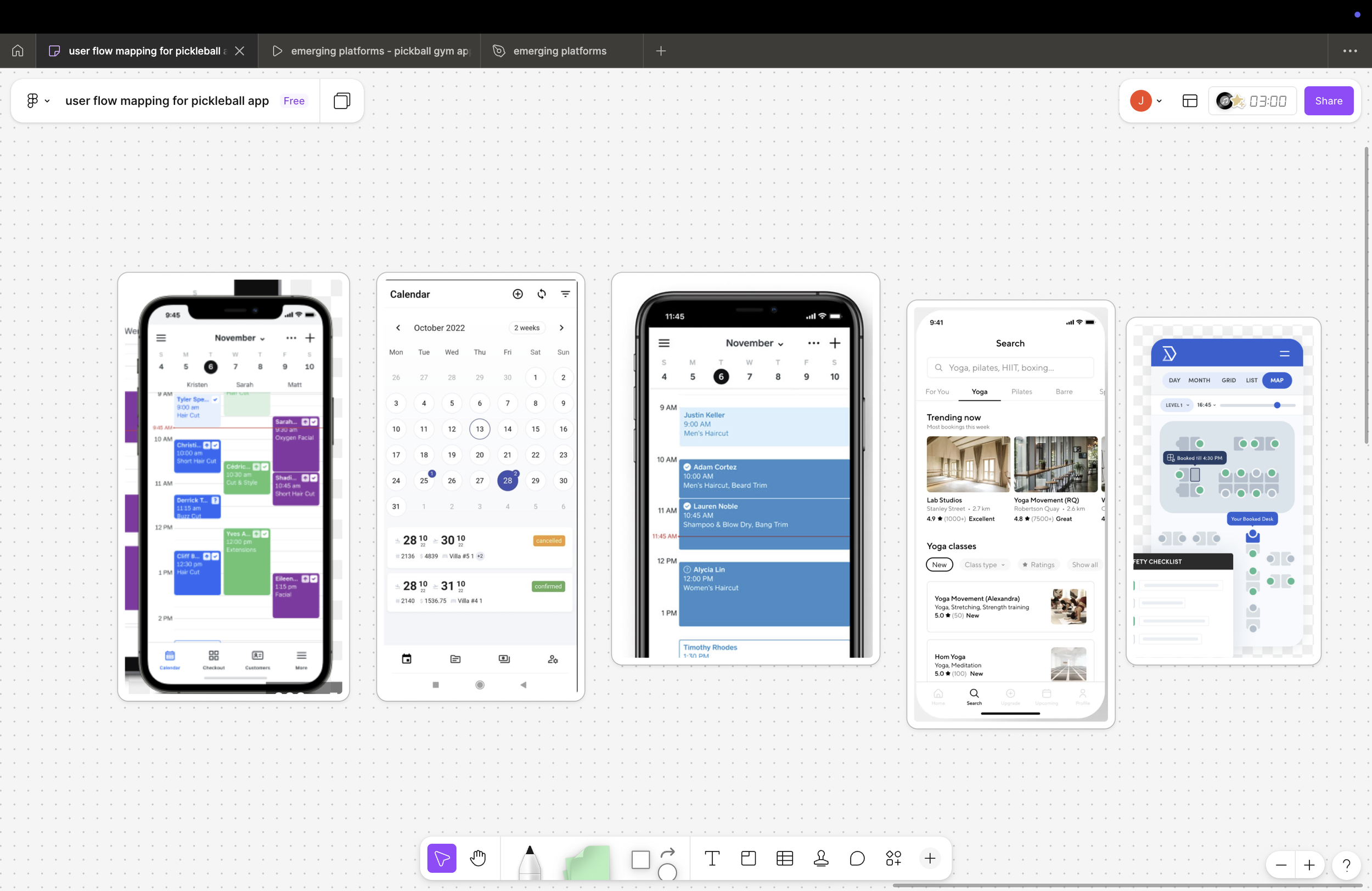
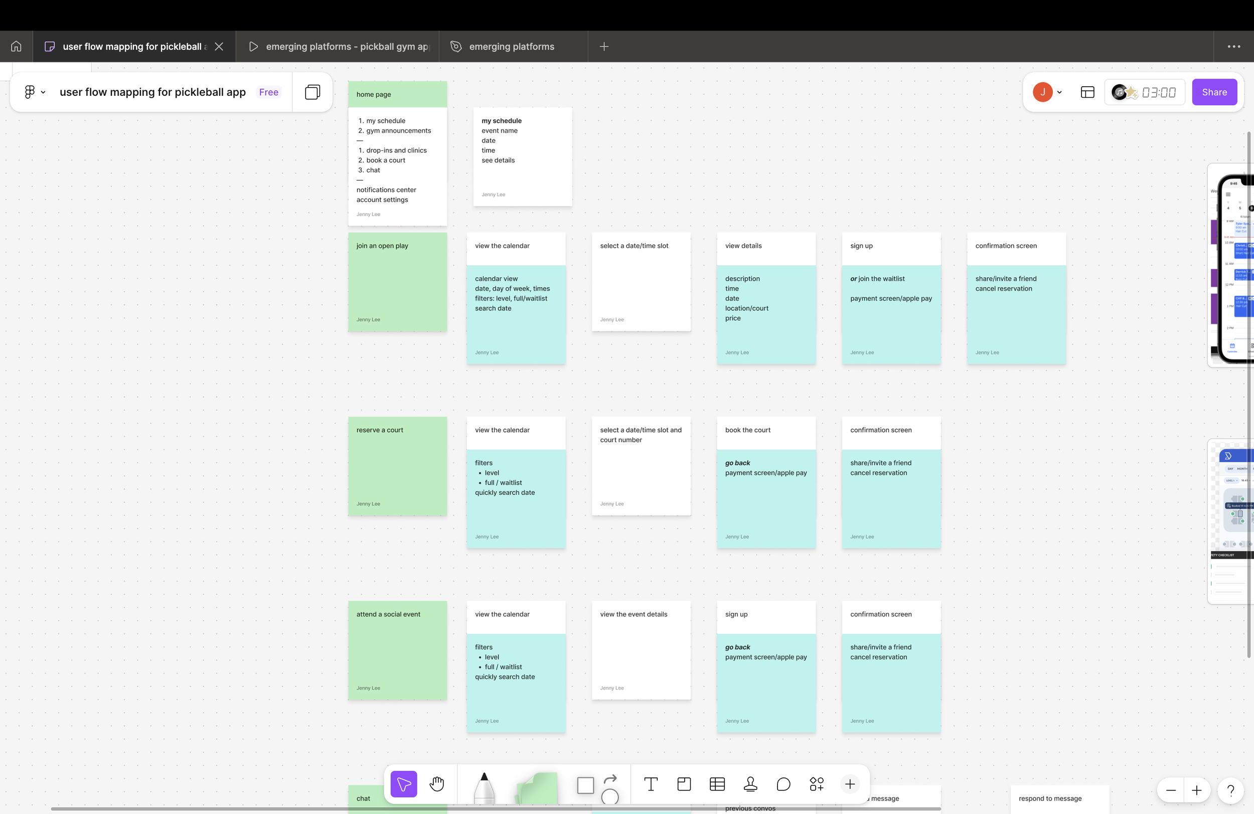
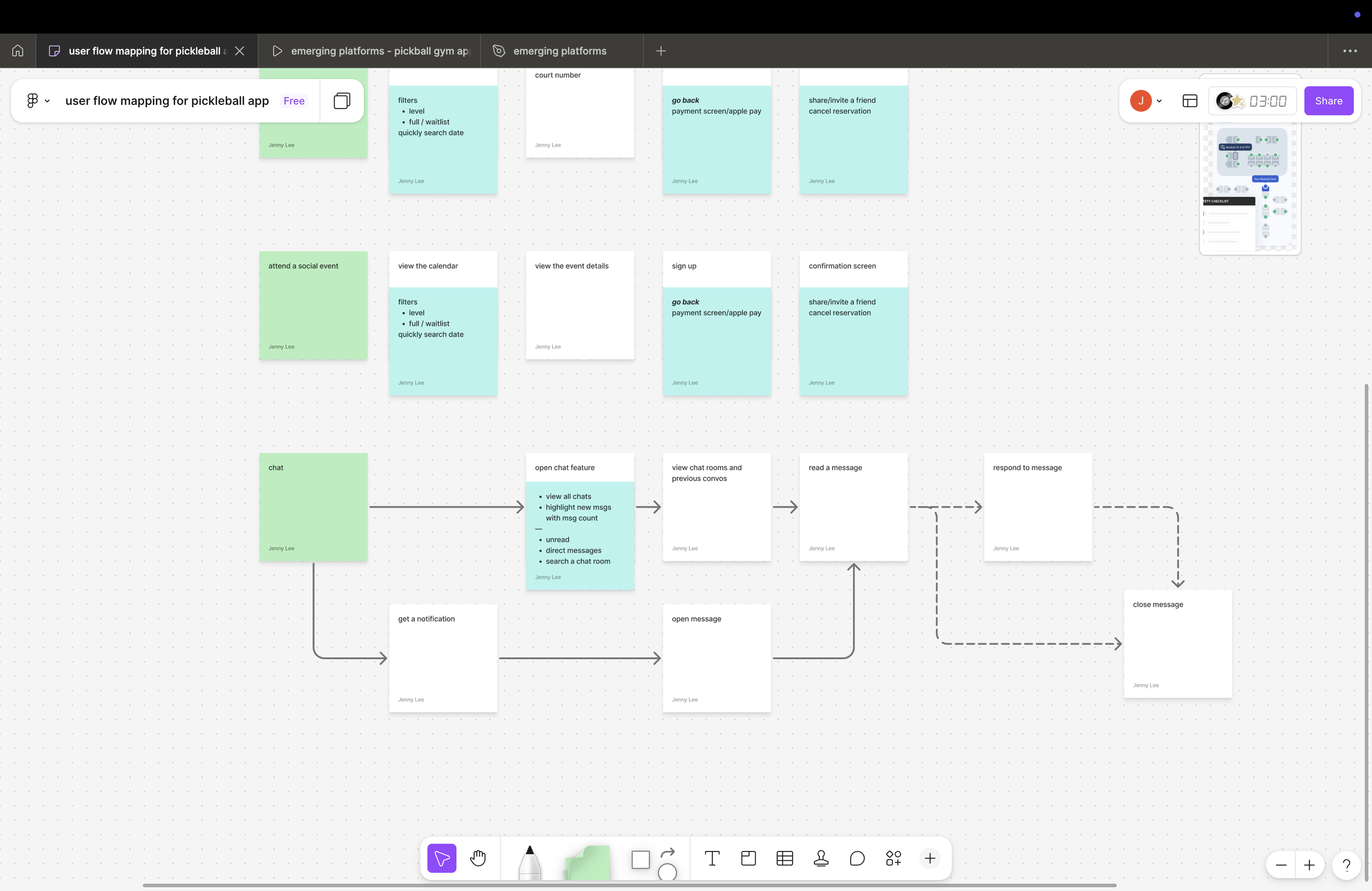
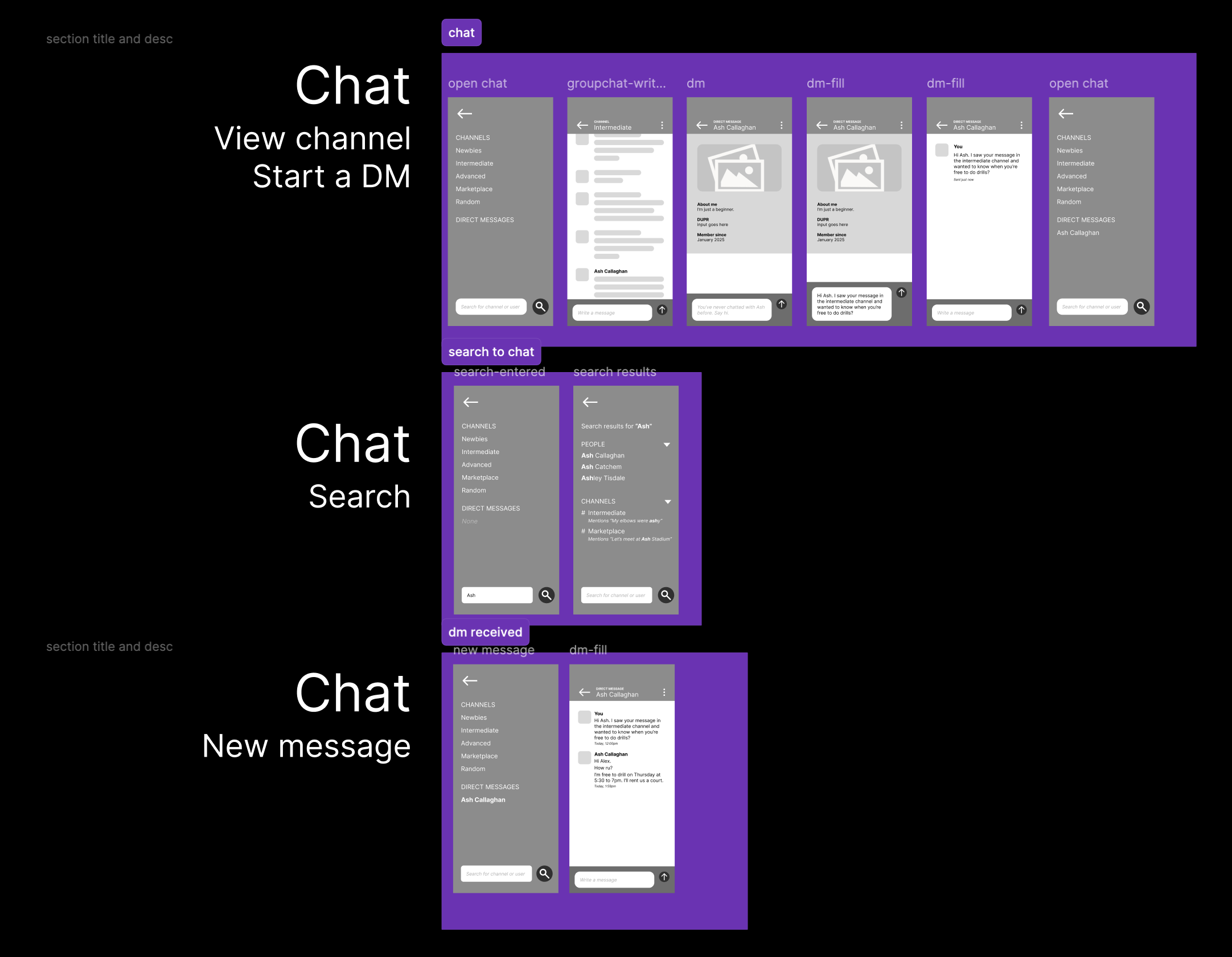
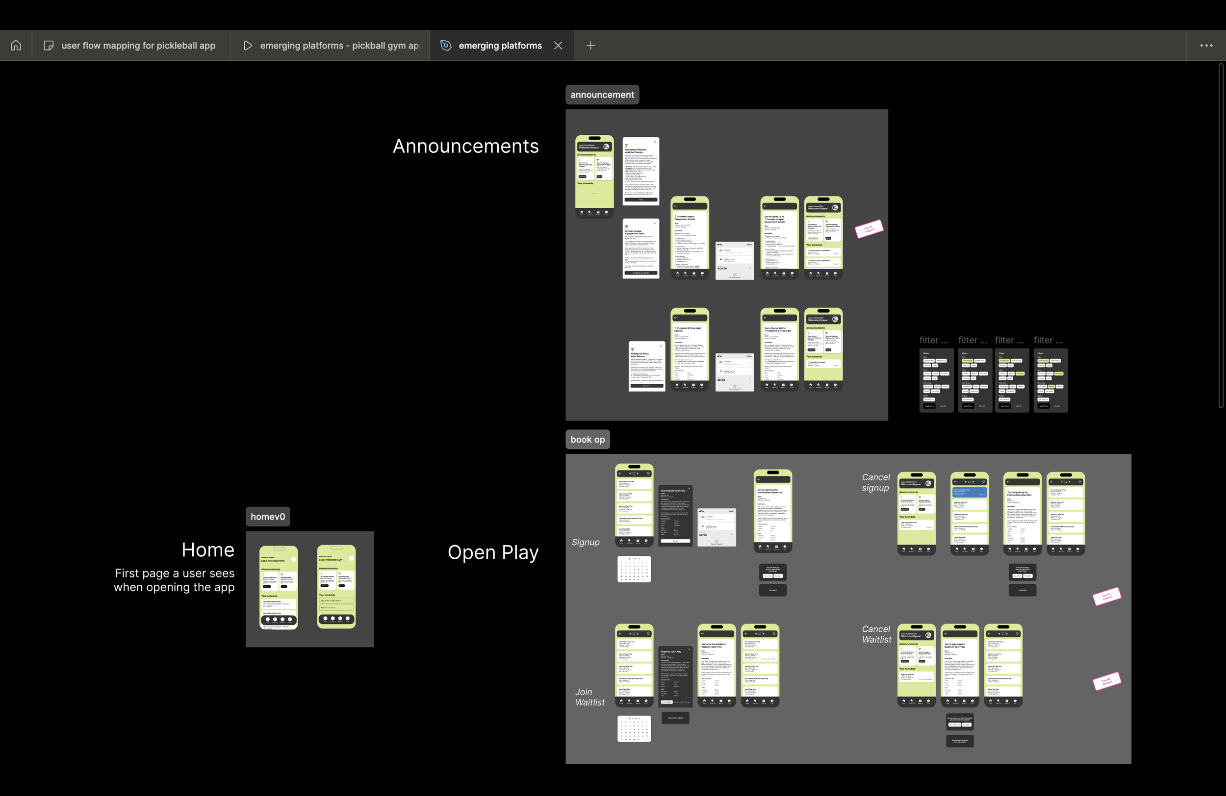
In v1, features lived side by side without a strong narrative. I explored multiple home screen models, experimented with different entry points to chat and announcements, and tested both calendar-first and action-first flows. Concepts that required users to interpret availability were dropped in favor of designs that surfaced clear next actions, such as “Sign up,” “Join waitlist,” or “Reserve a court.”
Design Decisions
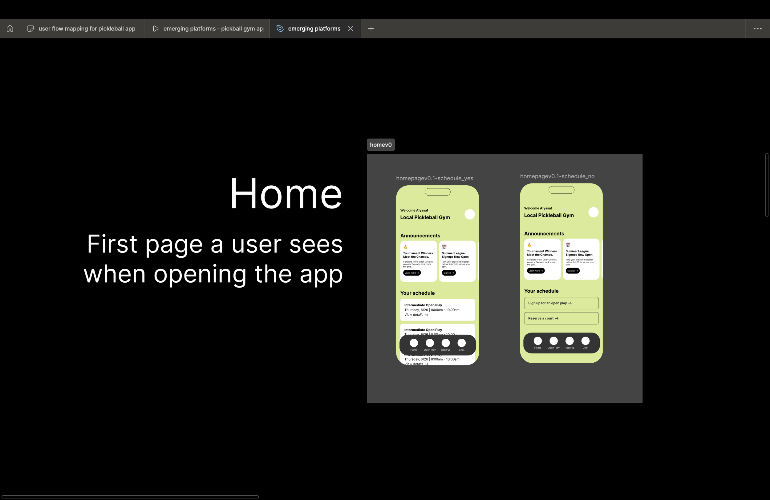
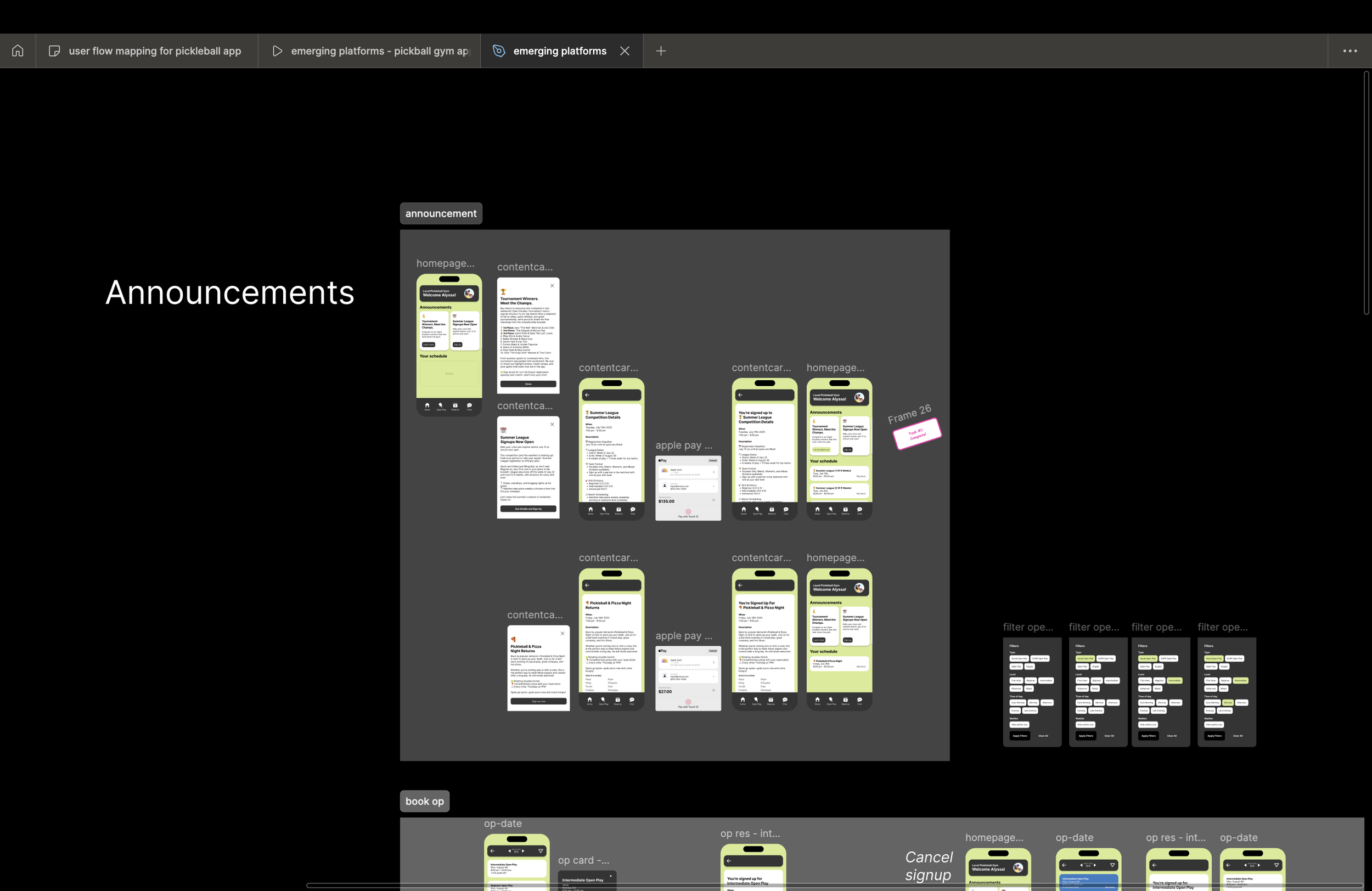
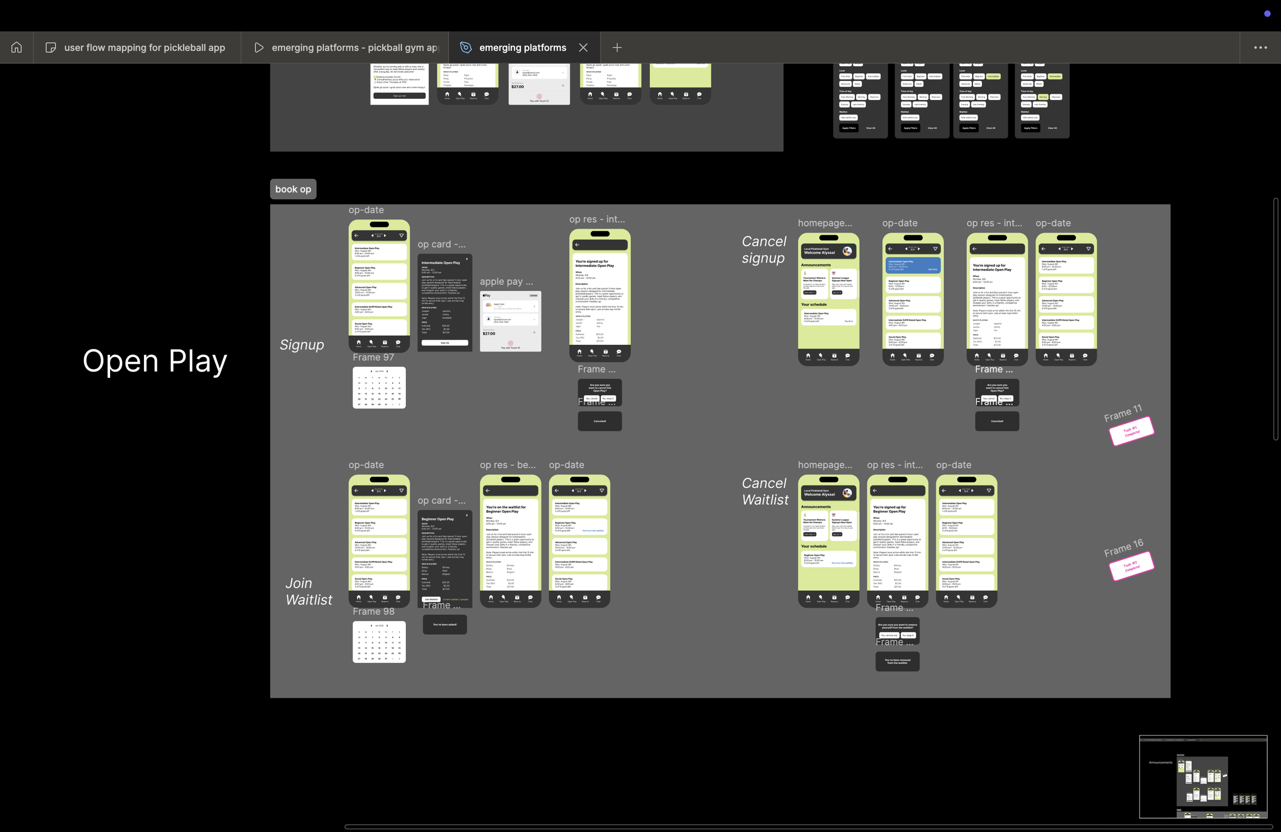
The largest shift from v1 to v2 was prioritization. The home screen became a dynamic dashboard rather than a static list. Announcements were elevated to reinforce gym-wide context, while scheduling adapted based on whether a user already had bookings. Chat was reframed as contextual and searchable, not just a message list. Each decision tied back to reducing ambiguity and helping users act quickly.
Prototyping & Testing
I validated flows through clickable prototypes, walking users through common scenarios like joining open play, canceling a reservation, or responding to a message. Feedback consistently pointed to improved confidence. Users felt they understood the system without needing instructions. Areas of confusion, such as date selection and waitlist states, were iterated on quickly.
Final Solution
The final v2 experience opens with a personalized home screen that reflects the member’s current state. Users can immediately see announcements, upcoming play, and available actions. Booking and waitlist flows are streamlined, with clear confirmation and cancellation paths. Chat is integrated as a utility, supporting coordination without overwhelming the core experience.
Impact & Results
While this was a concept project, projected outcomes included higher session fill rates, fewer missed bookings, and increased engagement with gym updates. The redesign demonstrates how clearer hierarchy and state-aware UI can directly support both community building and operational efficiency.
Reflection & Learnings
This project reinforced the value of designing for uncertainty. Small clarity improvements—labels, states, and defaults—can have an outsized impact on confidence and behavior. It also strengthened my ability to connect UX decisions to business outcomes, informed by my marketing background.
What’s Next
Future iterations could include smart recommendations based on play history, automated waitlist notifications, and AI-assisted announcements tailored to skill level or availability. Testing these features with real gym members would help validate personalization strategies and further reduce friction for new and returning players.